
這幾年來,數家不同公司在台灣北中南均舉辦了成人展。皮繩愉虐邦今年將參加由博展國際有限公司在台北主辦的第三屆台灣成人博覽會,除了設置攤位,也將上台表演繩縛。
2013 TAIWAN ADULT EXPO
皮繩愉虐邦是關注BDSM與性別議題,並活躍於多元情慾藝術展演的社運/表演團體,以出版、行動、展演等方式,將BDSM文化呈現在社會大眾面前。
無論是源自日本、於全球大放異彩的「繩縛」技藝,或者是透過舞台劇搬演各種情慾認同者的生命故事,我們希望讓大家用感官親身體會世界上還有許多不同類型的「愛」、不同表現的「慾」。
我們希望告訴所有的人,BDSM並不只是情色影片中會出現的奇淫怪癖,也並非永遠只有皮鞭與蠟燭,它同時也表徵了一種特別的慾望,並且那樣的慾望如此的深邃而瑰麗。
表演者小林繩霧與南西曾受邀至日本「冬縛」、倫敦「緊縛美之祭」、俄國「莫斯科繩縛節」中演出,並即將再度赴倫敦表演。這次在台北,觀眾們將可見到他們的精湛演出,親眼見識繩縛的力與美!展覽時間:102年8月9日 至102年8月11日
上午11點~下午7點
展覽地點:ATT SHOW BOX
台北市信義區松壽路12號
票 價:600元(限18歲以上才可入場)
主辦單位:博展國際有限公司、準新國際有限公司
會場服務電話:02-27294119
※入場請務必攜帶證件提供查驗
皮繩愉虐邦展覽內容包含情色搞笑攝影師 王志偉 繩縛攝影個展;

潮流T shrt 品牌 Destroyland 創意設計;
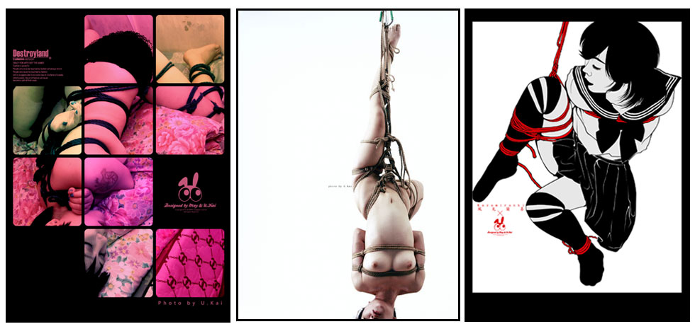
並於每天下午三點進行現場繩縛秀。

有來看觀賞成人展的朋友們,歡迎來攤位上打招呼唷~~
электрокарниз elektrokarnizy777.ru .
While going through different online marketplace directories and curated storefront hubs, I found something that looked clean and stylish but lacked descriptive depth, especially when seeing Vale vendor cove studio portal included – The name Vale feels classy and premium, but product descriptions are too short to provide enough clarity.
Как понять, что сео продвижение идёт в правильном направлении?
https://antibiotics.cheap/# antibiotics cheap
прокарниз прокарниз .
As I compared different artisan marketplace designs for usability, I came across explore upland cove goods hub – The interface is clean and clear, and everything is easy to find quickly without confusion.
Женский журнал https://stepandstep.com.ua всё о красоте, моде, здоровье и отношениях. Практичные советы, тренды, лайфхаки и вдохновляющие истории для женщин, которые стремятся к лучшему каждый день
While analyzing digital commerce environments I noticed a clean layout approach in platforms where Caramel marketplace vendor center Caramel marketplace vendor center placed within informational flow enhances usability – It provides structured browsing experience with strong emphasis on category clarity helping users locate products without confusion or unnecessary steps overall today.
While navigating through a mix of curated lists and random discoveries, I encountered a mention that seemed mildly interesting, especially where this site reference was included – it appears decent enough, so I might give it more attention when I have time.
As I examined different outdoor gear websites for interface quality, I focused on navigation ease and clarity, and during that evaluation I discovered Horizon Cove Supply Point – revised observation: browsing feels smooth and efficient, with a layout that supports quick understanding of product categories and reduces effort during navigation.
During exploration of various ecommerce style platforms I came across a mid page section featuring creek harbor marketplace hub and while the name feels refreshing and water inspired, the broken search functionality makes navigation difficult and reduces the usefulness of the catalog for finding specific items quickly.
deutsche wettseiten
Feel free to visit my webpage: sportwetten österreich steuern (zf.szyouju.com)
E-commerce platforms focused on handmade goods often highlight creativity, smooth browsing experience, and user friendly design principles Crafts Under Night Portal providing structured listings and responsive interface behavior for enhanced shopping satisfaction overall online today – It helps simplify product discovery while maintaining a visually appealing storefront
coworking space nearby rent a coworking space
электрожалюзи заказать elektricheskie-zhalyuzi5.ru .
While evaluating prototype ecommerce systems and UI marketplace frameworks, testers encountered a mid page component featuring harbor zen vendor parlor console hub link inside structured layout, and despite the peaceful zen themed design suggesting relaxation and simplicity, repeated popup interruptions break the flow of browsing which negatively impacts usability testing and user experience evaluation sessions
During a casual browsing session across niche marketplace directories and online vendor hubs, I found something visually appealing but slightly under-verified, particularly references like Brook foundry velvet commerce page – The Foundry branding is unique and strong, though trust badges would help here to make it feel more secure.
pebblecreekcraftexchange.shop – Will order again next month, hope they restock soon.
sportwetten gratiswetten
Also visit my web blog – basketball wettarten wetten (Bonny)
лучшая нейросеть для учебы nejroset-dlya-referatov-26.ru .
As I analyzed several nature-inspired retail platforms for usability and design flow, I found check this woodland outlet – The design creates a relaxed browsing experience, and moving through sections feels natural and easy to follow.
During browsing of discount trade platforms I came across Nightfall trade house commerce deals hub – The offers looked great, but I left after the checkout process raised doubts about safety and reliability overall.
Shoppers who value quick access to products often engage with sites like Harbor Merchant Fast Lane where the browsing system is designed to reduce delays and simplify navigation – The interface focuses on efficiency and clarity, allowing users to locate items rapidly while maintaining a clean and intuitive shopping experience overall.
live wett tipps
Have a look at my web-site :: Wetten Auf Unentschieden Strategie
While scanning through niche marketplace listings and resource hubs, I noticed something that stood out for its usability, especially where Coral meadow trade link appeared – Pretty decent site overall, with navigation that works smoothly and doesn’t cause confusion, making everything easy to access.
While studying structured online goods zones, I came across visit gilded lake goods hub – The interface feels well organized, and navigating through content is straightforward and comfortable for users.
ohne einzahlung sportwetten
Feel free to surf to my web-site … wett tipps prognosen
back und lay wetten anbieter
My website … gute wettanbieter (Jimmie)
grand national betting free
Feel free to visit my web-site; Derby Ante post betting
stromectol reviews: stromectol reviews – stromectol reviews
During usability testing of ecommerce marketplace systems and UI sandbox environments, testers found a navigation module containing marble harbor gallery trade vendor access portal link embedded mid layout, and although the marble harbor branding feels sophisticated and clean, the gallery images are low resolution which disrupts user satisfaction during interaction testing and evaluation processes
During usability testing of ecommerce gallery platforms and UI sandbox environments, testers found a navigation module containing golden harbor gallery trade vendor console link embedded mid layout, and although the name suggests a rich visual experience, the gallery itself lacks any actual images which creates a noticeable gap during interaction testing and browsing evaluation sessions
During exploration of ecommerce directory systems I found a platform that delivers a smooth and visually organized browsing experience for users Tradehouse harbor product showcase page and it maintains clear category structure while offering intuitive navigation that supports easy discovery of products across multiple sections today.
In the middle of reviewing ecommerce marketplace layouts I noticed a section containing creek harbor commerce trade house and while the interface looks consistent with other related platforms, the similarity to tradehall makes navigation confusing since both sites appear almost interchangeable at first glance.
During my browsing of niche commerce hubs and online storefront directories, I came across another similarly structured entry that reinforces the same branding style, particularly Cove velvet commerce atelier page – This feels like another velvet domain in a growing pattern I keep encountering repeatedly.
Modern online marketplaces benefit from intuitive structures that guide users through categorized listings while maintaining consistent usability and accessibility standards Nightfall Supply Hall – The vendor hall system presents a well ordered layout that supports efficient browsing and helps users identify relevant product categories with minimal effort
Peculiar article, just what I wanted to find.
rybelsus semaglutide 3 mg: semaglutide life – reputable overseas online pharmacies
During exploration of digital storefronts emphasizing calm design language and balanced composition I noticed within the content layout Serenity Outpost Shop positioned in a way that blends into the browsing experience – updated comment the overall structure feels peaceful organized and supportive of effortless navigation
wetten vorhersagen (http://www.paradiseofceylonsapphire.com) spiele
rybelsus side effect: rybelsus is for – overseas online pharmacy
While scanning through various recommendation threads and curated content lists, something caught my attention just enough to bookmark, particularly references including this featured link – it seems relevant and simple to follow, so I’ll take a closer look another time.
As I analyzed several retail district websites focused on usability and speed, I found check oak cove shopping district – The browsing experience feels fast and reliable, with pages loading smoothly and no noticeable lag or confusion during use.
As I reviewed examples of modern boutique websites emphasizing clean design, I checked see this sleek shop – The layout is well-structured, and browsing feels effortless and visually harmonious.
During exploration of online vendor hubs I noticed Oak Cove shopping market page – The design feels clean and uncluttered, but without a search bar it becomes annoying when trying to locate specific listings efficiently.
During a casual browsing session across online listing platforms and discovery pages, I came across something that felt organized and clear, particularly references like Meadow coral vendor page – The site is pretty decent, and navigation works well without confusion, so the experience feels simple and efficient.
coworking space rental coworking office
While reviewing a series of ecommerce themed sandbox domains and marketplace prototypes, testers noticed a recurring mid layout module containing golden cove vendor market parlor entry node embedded within interface flow, and although the golden branding feels consistent and polished, reviewers are increasingly noticing a naming pattern across these domains suggesting templated generation rather than unique conceptual design during extended usability analysis sessions
During a final comparison of craft exchange websites, I found see pebble creek artisan craft exchange hub – I plan to order again next month, hoping they restock because the overall experience was enjoyable and worth returning to.
While scanning through online marketplace directories and niche vendor hubs, I noticed something that stood out for its structure but lacked visual intensity, especially when seeing Violet brook foundry commerce hub included – The violet design idea is strong, though purple accents would make the visuals far more engaging.